PokerStars to Remove Tabbed View

Recently,
PokerStars made a change removing the fold button from the poker client if there was no action in front of a player and just keeping the valid options of check and fold. This wasn’t that controversial, although not all players liked it.
Those in favor understood that this helps new players not make mistakes like folding hands that are free to continue on even though the poker client gave a warning about it and also understood this could speed up play for those players. Those against it also felt they should have the option to fold to speed up their play or that new players should be allowed to make big mistakes.
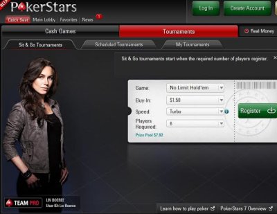
Perhaps more controversial was an announcement PokerStars made on Two Plus Two where they are eliminating much of their tabbed view of their poker client. When PokerStars upgraded to its latest poker client, it introduced a filtered option which was the default for the client. However, those that preferred to still use the tabbed view were able to do so.
PokerStars 7 Community Manager Keith announced that, “FYI - We will be making a change to the desktop clients (both PC & Mac versions) in the near future: We are discontinuing the legacy Tabs view for the Cash, Zoom, Sit & Go and Tournaments sections of the All Games lobby, to put everyone on the more versatile Filters view,” and added that these changes will take place sometime in February.
Main tabs for Cash, Zoom, Sit & Go, KO, Beat the Clock, Tourney, and Events will stay, however, the sub tabs underneath will no longer be an option with players being forced to use filters to find what they are looking for.
Keith added that, “We understand that many players are comfortable with the Tabs view and this is not a decision that was taken lightly. We maintained the tab system for a few years after the introduction of PokerStars 7. However, based on the percentage of people using it and with further development plans in the pipeline, this simplification will help us to continuously improve our software and develop features in a more streamlined way, which will benefit your overall poker experience.”
Perhaps many players were using the filtered version is that this was the default version. Personally, I find the tabbed view far more intuitive to use.
Also, to suggest that this will help with future development plans and that will benefit my overall poker experience sounds like a cop out rather than a valid reason. To me it sounds like just yet another money saving scheme on PokerStars to not support something that makes sense for many players. They probably need to employ less people to support just one version and wouldn’t really actually delay any future features.
In addition, to suggest that this will improve my overall playing experience by removing something, doesn’t sit well. It would make more sense that they just would say it doesn’t make financial sense for us to support more than one view. Removing an intuitive view that many players prefer using isn’t in any way improving this subset of players’ overall experience.
That being said, I am sure myself and others using the tabbed view will get used to using the filters. I did try it out when the software was first rolled out and just preferred the tabbed view. PokerStars at least did give some notice before rolling it out, meaning it wasn’t just sprung as a surprise to its customers.
BECOME A MEMBER of PokerSoftware.com today. You can chat with us and ask questions to our poker software experts in the forums and get access to
EXCLUSIVE members-only content.
Sign up today!
More articles
 Recently, PokerStars made a change removing the fold button from the poker client if there was no action in front of a player and just keeping the valid options of check and fold. This wasn’t that controversial, although not all players liked it.